Patrick Rocha / Travel Guide
Branding
The Logo
Patrick Rocha is a travel guide based on Sal, Cape Verde. He works with tourists visiting the island, helping them book activities. Most of his clients find him at his office at the beach entrance or by picking up his card.
He wanted a nice card. And a logo with a shark. It’s the animal he identifies with. But it means much more. Lemon sharks breed in Shark Bay on the east coast of Sal. Juvenile sharks gather there, in the shallow water, year-round and don’t leave until they grow big. Besides them, there are also larger sharks in Cape Verdean waters — but these tend to stay far offshore. Sometimes you can see their fins near the horizon. Sharks are part of Sal’s identity.
Patrick’s new logo is clean, has a big lemon shark in the water, all hand-drawn.
Business Cards
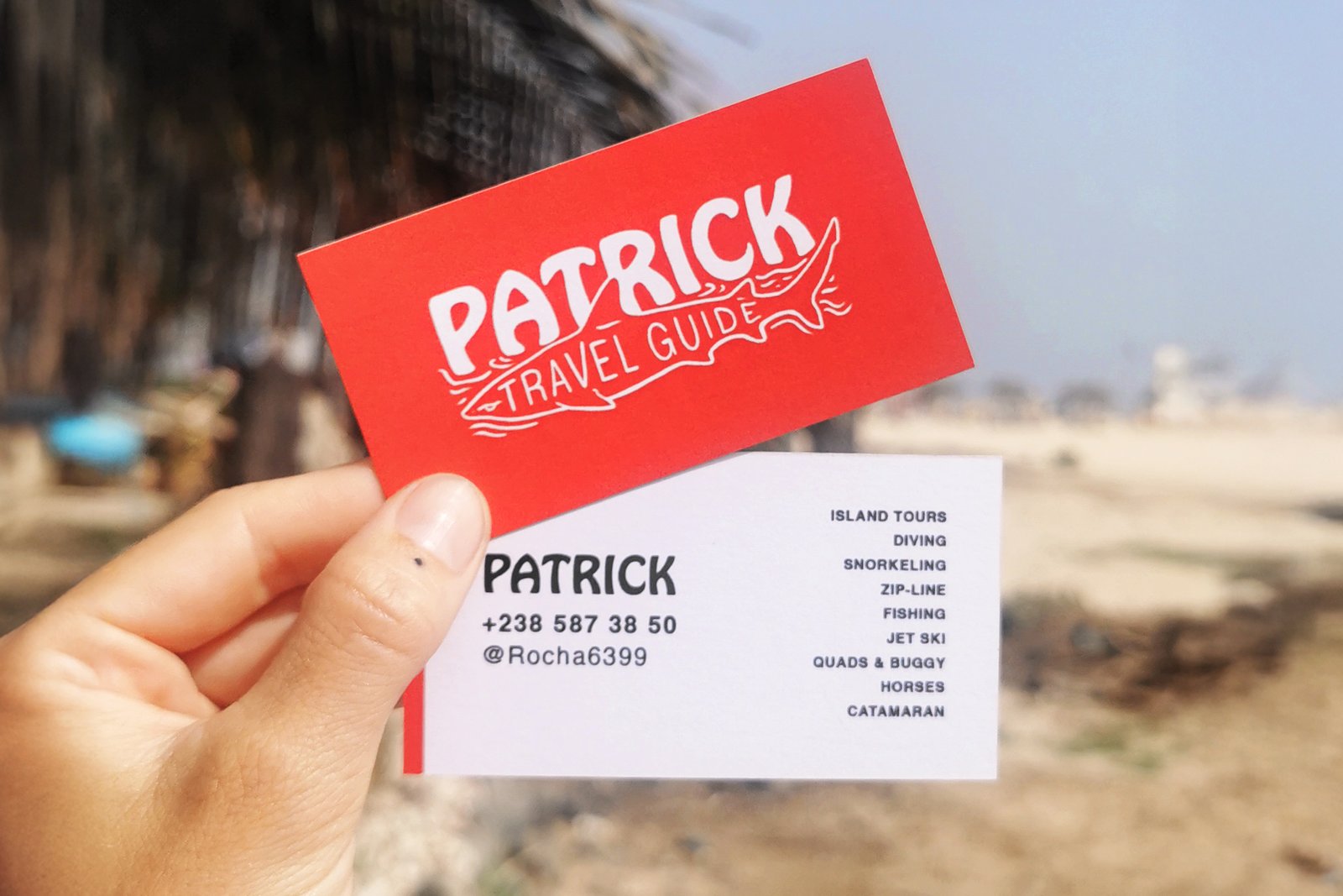
The business cards use a solid red front — Patrick’s favourite colour — with the logo printed in white. The contrast is strong enough that the card is immediately visible even when stacked.
The back is almost all white. It has a clean red stripe (for visibility, again), contact information on the left (name, phone number and Instagram), and a list of main bookable activities on the right.
The layout is clean and straightforward, a practical choice — these cards get handed out on beaches and at tour pickup points, to people who tend to make quick decisions. Everything a potential client needs is there at a glance: who to contact, how to reach them, and what they can arrange.