Jarek Niesłuchowski / Personal Trainer
Logo | Visual Identity | Business Cards
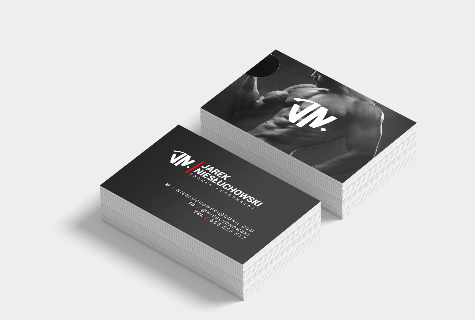
A visual identity for the personal trainer Jarek Niesłuchowski, centred on a compact JN monogram hand-drawn to look like a shield — a symbol of both a warrior and a protector. The two meanings are important to Jarek, as he sees training not only as a means of building strength but also as an investment in health. The mark was designed to feel physical and slightly aggressive, but still readable as initials. A sharp red slash cuts through the system, adding even more movement and giving the black-and-white palette a direct point of energy. After that comes the information: “who I am and what I do” — name, surname, and job.

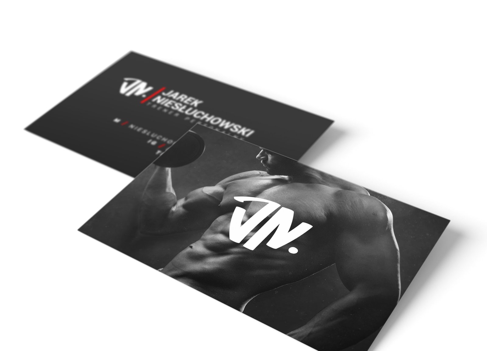
The business cards carried the identity into print: strong contrast, photography focused on the beauty of physical strength, clean contact details, and the logo placed like a stamp of force. Simple, functional, eye-catching, and made for a profession where the body is the message.