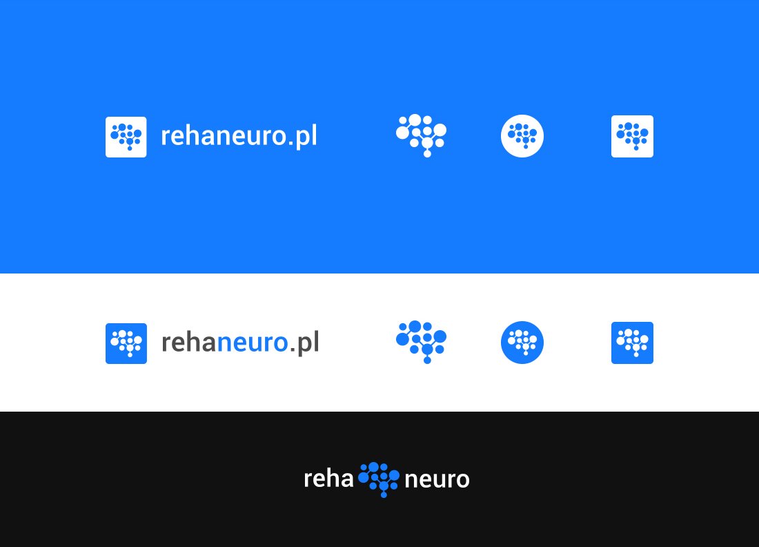
Rehaorto / Rehaneuro / Rehakardio
Branding | Winning competition project

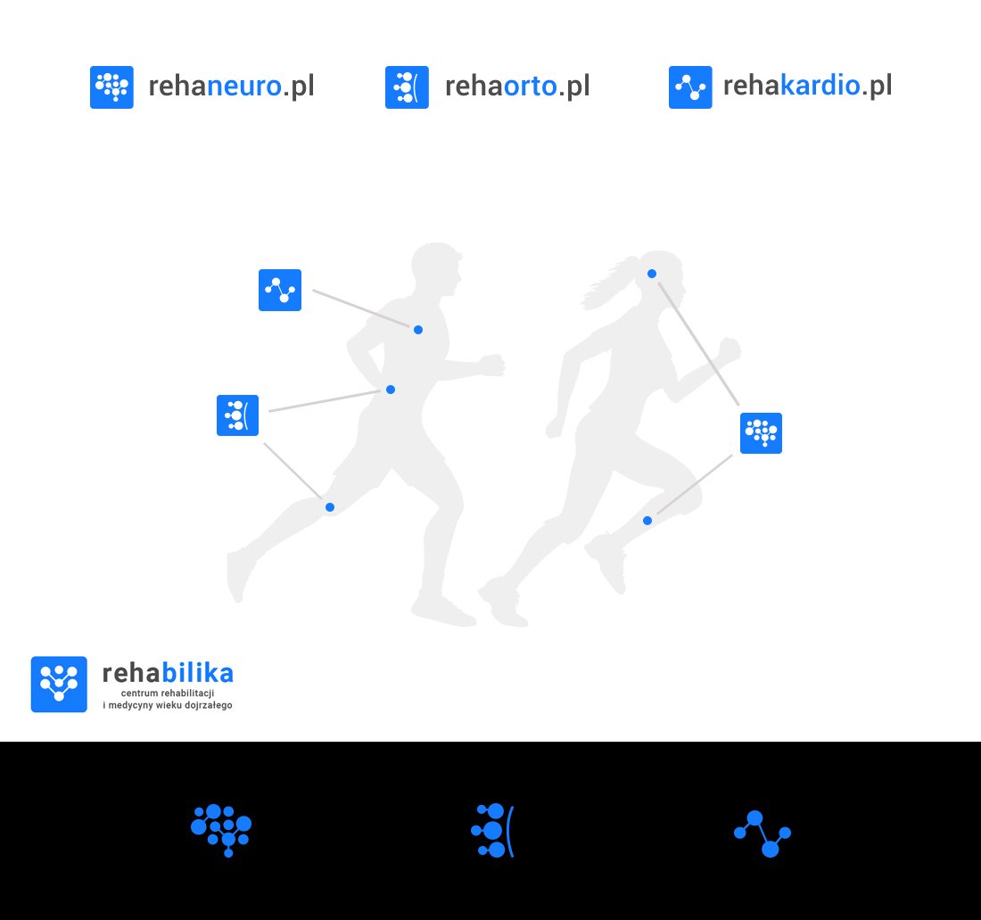
This branding project involved creating a logo system and brand book for three branches of Rehabilika (Poland): Rehaorto, Rehaneuro and Rehakardio; and later (2020) also for Rehabilika itself. My projects were selected for a branding competition from among several submitted concepts and served as the basis for the company’s visual identity system, which is still used today (2026). The task was to design signs that could function as separate, specialistic service areas while still recognisably belonging under one parent brand. Rehaorto stands for orthopaedic, Rehaneuro for neurological and Rehakardio for cardiac rehabilitation, all united under Rehabilika. Each needed an individual symbol, while sharing a single visual language.

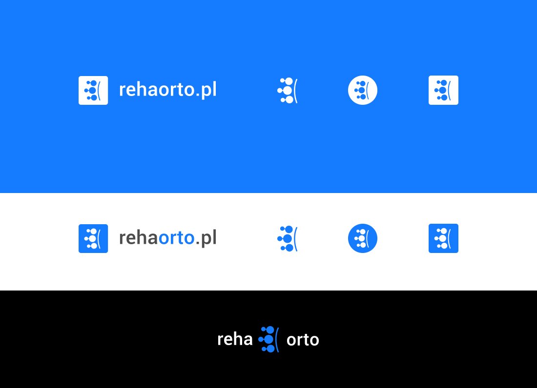
To underline the professionalism and medical character of the branches, I decided to use a simple, modular rule: clear typography and clean, minimalist symbols based on body-related structures that correspond to specialisation. The rules of the new visual identification system were clearly described in the company’s brandbook, which included logo versions, alternative symbols, colours, typography, minimum sizes, light and dark background versions, and incorrect uses.
The result is a practical identity system for a medical brand with several branches: simple, readable and easy to apply across websites, printed materials and signage.
Website: rehabilika.pl