NoiJak
Branding
A branding project from 2009 for a small Polish casual ballet clothing brand. I won the graphic design competition for the company’s visual identity. The name, Noijak, works like a small challenge: so, how is it? It has lightness, attitude, and a little teasing energy — good for clothes that stand somewhere between ballet softness and everyday city wear.
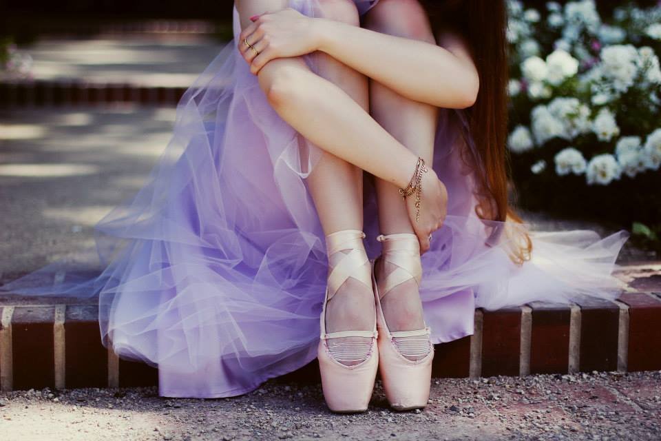
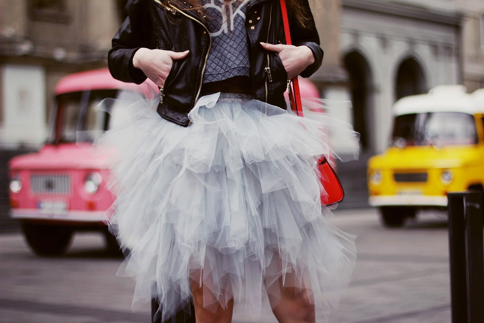
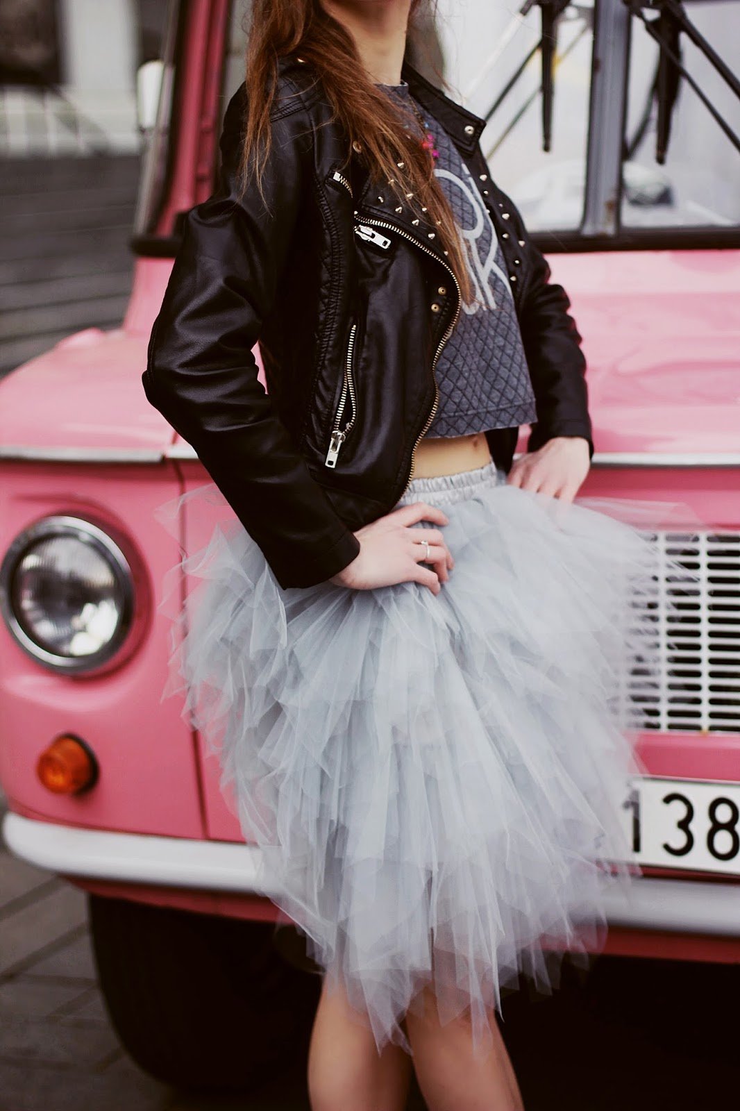
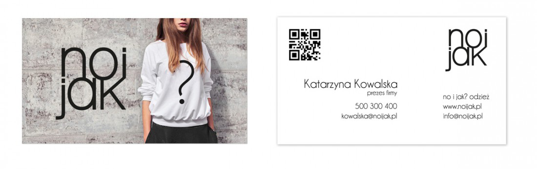
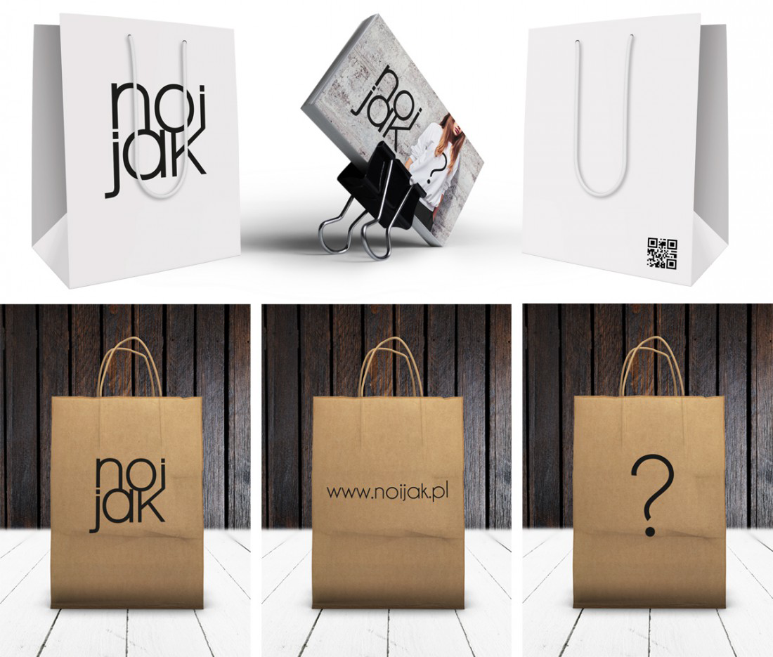
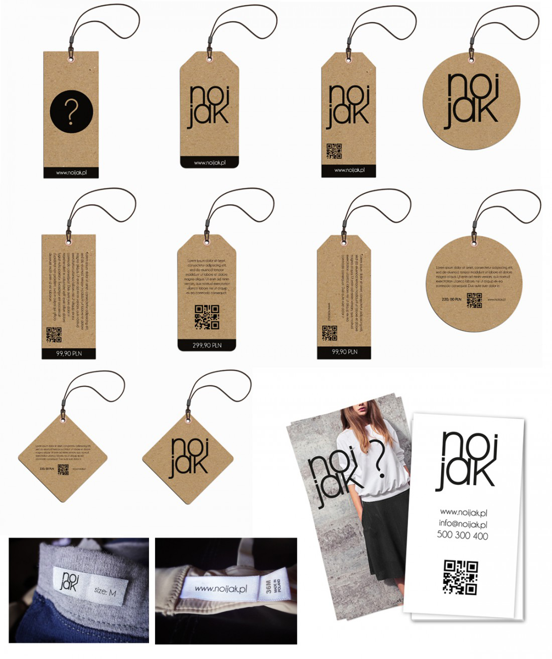
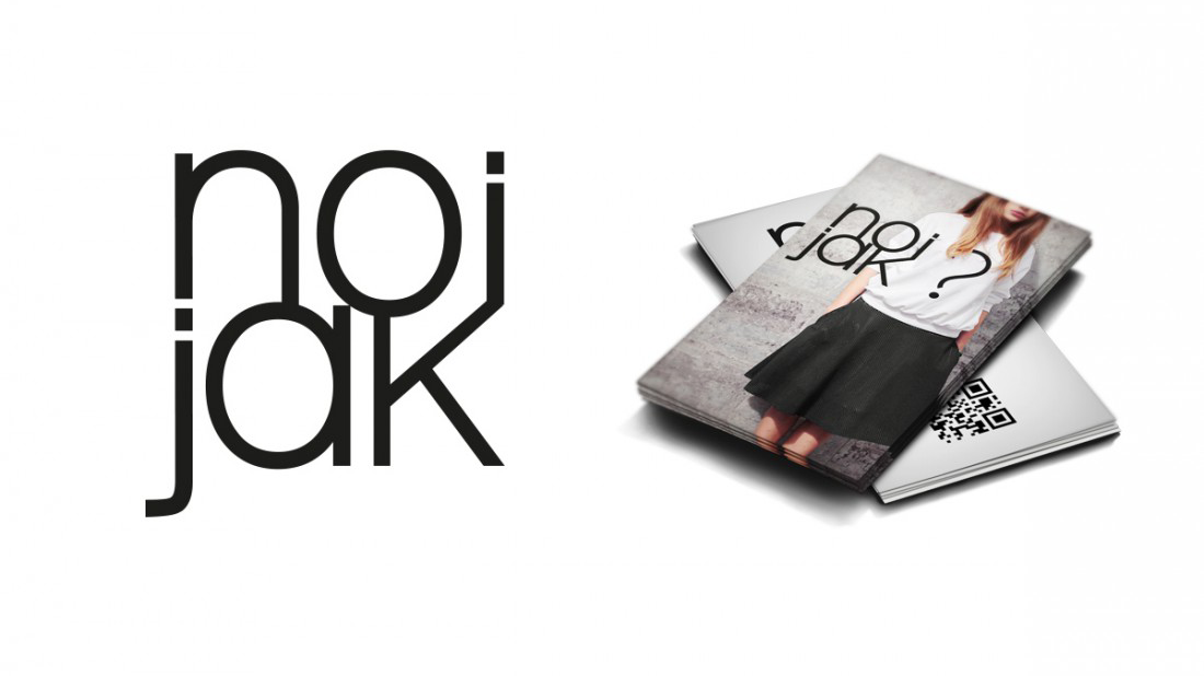
The logo turns the phrase into a compact typographic mark, simple enough to work on labels, tags, bags, business cards, clothing, and photographs. The system was built around contrast: tulle and leather, ballet shoes and street clothes, softness and confidence, handmade materials and clean black typography. The sign can fit all the materials and colours used by the brand, without weighing it down or stealing the focus from the design.
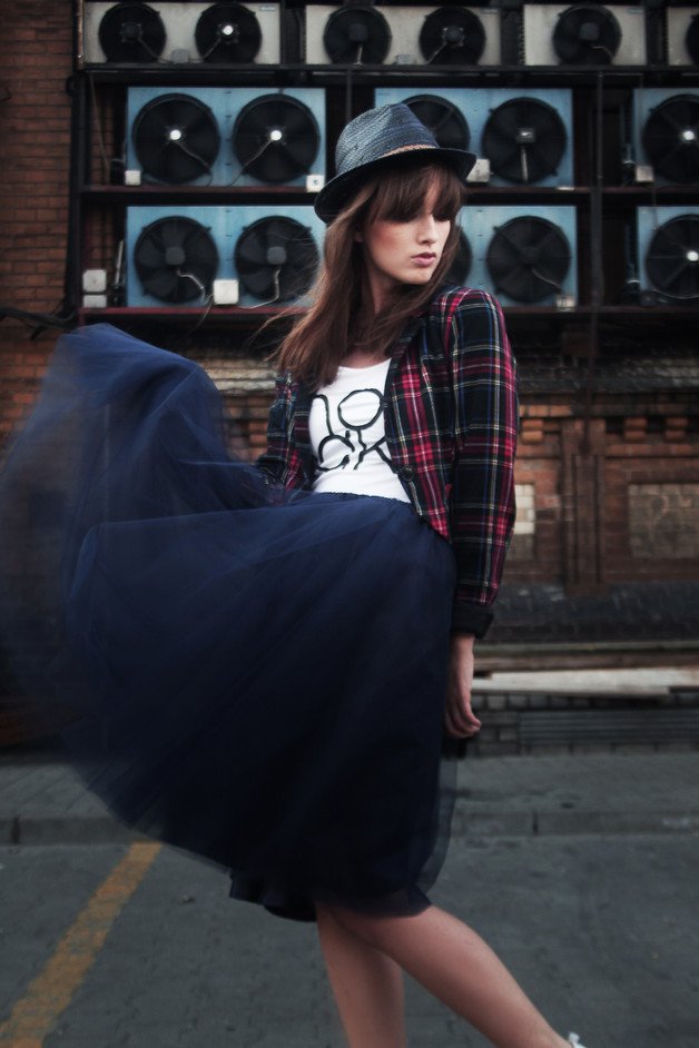
The identity extended into paper tags, textile labels, shopping bags, business cards, photo materials, and brand applications. Kraft tags gave the brand a handmade, small-run feeling; clean white bags kept it lighter and more boutique; the photographic materials carried the same tension as the clothes — soft fabric, street posture and ballet references.